Aesthetics
Monochrome by default
By Yuki Almeida, Tradition and aesthetics Published 9 September 2026
Rope images are usually monochrome because black and white does three things the subject needs: it converts every difference in the frame into a difference of brightness, which is the only channel the eye reads quickly at small sizes; it removes the colour of skin, which otherwise dominates any frame containing a body; and it flatters the twist of fibre, whose whole visual interest is a pattern of small shadows. The convention also has an unglamorous origin. For thirty years the pictures were printed on cheap paper that could not hold colour, and the habit outlived the constraint.
This site writes about rope as an image, and it publishes no tying instructions: no steps, no named ties given as method, nothing to follow. Rope on a body carries real physical risk, and anyone who wants to learn it should learn in person, slowly, from experienced teachers.
Look at any collection of rope photographs, from the postwar magazines to a portfolio published last month, and the same thing is true of nearly all of them. There is no colour in them. That consistency is unusual for a genre with no rule about it, and it is worth asking what is doing the work.
Monochrome converts everything into one currency
A colour photograph asks the eye to separate objects by two things at once: how bright they are and what hue they are. Usually that is a benefit. In a rope image it is a distraction, because the thing the picture is about is the arrangement of light and dark, and a red cushion in the corner will out-argue any amount of careful tonal work.
Black and white forces every element of the frame into a single scale. A pale robe, a dark rope, a mid grey wall and a lit shoulder become four values, and the composition can be judged as an arrangement of those four. That is a considerable simplification, and simplification is what a picture with one subject needs.
It is also why monochrome pictures survive being small. At thumbnail size, hue is the first thing to go and brightness is the last. A rope image built on tonal difference still reads on a phone. One built on the colour relationship between two similar-brightness objects collapses into a smudge.
Skin is a colour that takes over
Any frame containing a body contains a large area of a single warm hue, and warm hues advance. In colour, that area will be the first thing the eye reaches and the hardest thing to move it away from, whatever the composition is trying to do.
Remove the colour and skin becomes a value like any other. It can be placed high in the tonal range or low, put in shadow, or matched against a robe so the two run together. It stops being the loudest element in the room and becomes material the photographer can arrange.
There is a related problem monochrome solves quietly. Fresh jute is a warm yellow brown, which is uncomfortably close to the hue of pale skin, and in colour the two can merge into a single warm mass with the rope only distinguishable where it casts a shadow. In black and white the problem mostly disappears, because the two materials differ in brightness even when they barely differ in hue.
The twist is a pattern of shadows
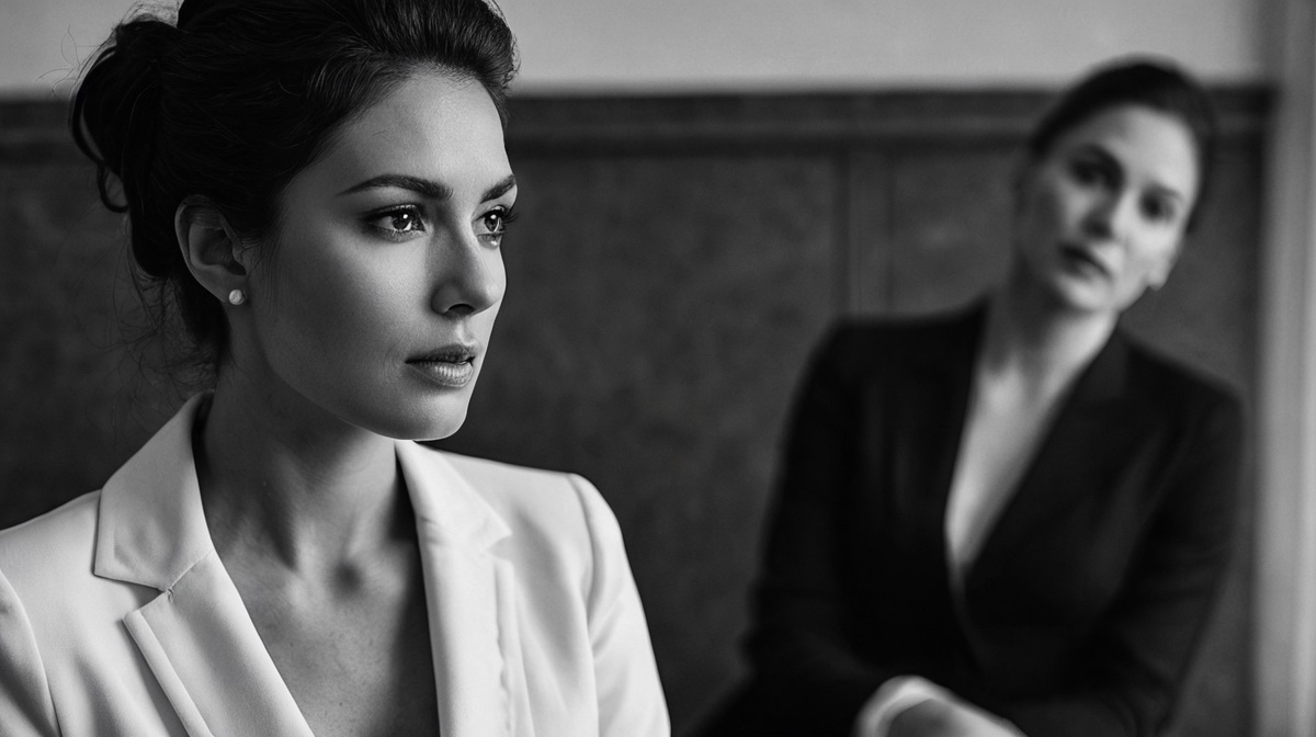
What makes rope look like rope is the spiral, and the spiral is visible only as a repeating series of small shadows running along the length. Shadows have no colour. They are the absence of light, and rendering them in a colour image adds nothing except the ambient tint of whatever is bouncing around the room.
So the single most important detail in a rope photograph is already monochrome before anyone decides how to process it. Everything that reveals it is a matter of the angle of the light rather than its colour, which is the argument lighting rope for photography makes at length. Black and white simply removes the information that was not helping.
The unglamorous half of the explanation
Aesthetic arguments for monochrome are all sound and they are not the whole story. For roughly thirty years the pictures that defined this genre appeared in cheap Japanese pulp magazines printed on poor stock. Colour was not on offer, and the reproduction available could barely hold the black and white it did print.
Every photographer who formed their eye on that material formed it on high contrast monochrome, and taught the next generation, who taught the one after. A convention that starts as a printing constraint can persist for decades after the constraint disappears, and the people maintaining it will supply aesthetic reasons in good faith, because by then the reasons are true. The look really is better suited to the subject. It also happens to be the look the subject was forced into.
This is worth knowing for one practical reason. A convention with a technical origin is easier to break intelligently than a convention with an aesthetic one, because you can ask what the original constraint was and whether it still applies.
When colour earns its place
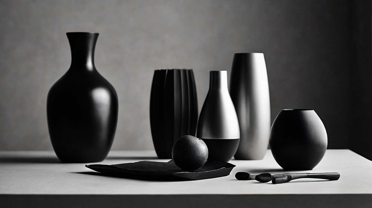
Colour works in rope photography in a small and identifiable set of cases.
When the colour is the point. Dyed rope in a saturated red against neutral skin is a colour composition and converting it to grey throws away the only interesting thing in the frame.
When there is exactly one accent. A single warm lamp in a cool room, one length of coloured silk, a painted wall behind an otherwise neutral scene. The discipline that makes this work is the same discipline that makes monochrome work: reduce the number of things competing for attention to about two.
When the picture is a record rather than a composition. Documentation should be accurate, and accuracy includes colour. A photograph made to show what actually happened in a room has no business being stylised.
Colour fails in the ordinary case, which is a frame that happens to contain colour because rooms do. Wood, skin, fabric, a rug, a plant, a door. None of it is chosen, all of it is present, and the result is a picture in which the arrangement has to compete with the furnishings. This is the same failure as a cluttered background and it has the same fix, which is to remove things rather than to grade them.
Deciding rather than defaulting
The useful position is not that monochrome is correct. It is that monochrome is the default for good reasons, that the reasons are known, and that a photographer should be able to say which of them applies to the picture in front of them.
The one line study on this site, one line across the back, is monochrome because it has one dark mark on a pale ground and there is nothing else in it that a second colour could describe. That is a decision. Converting a cluttered colour frame to black and white in the hope that it will look more serious is not, and it usually produces a grey version of the same cluttered picture. The tonal values what makes a rope image beautiful sets out are not conferred by removing colour. They have to be built in the room.
Questions readers ask
Why is shibari photography almost always black and white?
Partly because monochrome suits the subject. Rope reads through texture and texture reads through small shadows, and removing colour leaves nothing to compete with them. Partly because of inheritance: the postwar magazines that set the genre's conventions were printed cheaply in black and white, so three decades of formative work is monochrome, and photographers copy what they were formed by. Both reasons are real, and it is worth knowing which one is operating in any given picture.
Does colour ever work in a rope photograph?
Yes, in a small number of situations. When the colour is the subject, as with dyed rope against skin or a strong red used as a compositional element. When there is a single deliberate accent in an otherwise neutral frame. And when the picture is documentary rather than composed, where accuracy matters more than mood. Colour fails when it is merely present, because an unmanaged frame contains too many hues and none of them is doing anything.
Is converting a colour photograph to black and white the same as shooting monochrome?
Not quite, and the difference shows. A conversion applies a fixed recipe to whatever hues happened to be in the frame, so two objects of different colours but similar brightness merge into one grey. Working in monochrome from the start means arranging the scene by brightness rather than by hue, which usually changes the wardrobe, the background and the light. The conversion can be steered afterwards, but only within what was recorded.
History is a record of people who met
Every tradition on this page was carried by practitioners who found each other, argued, and worked. Reading about it is the smaller half.
Find the people